Read this article on Medium
Introduction
In the dynamic realm of UI development, a well-documented design system is the key to success. Welcome to the AWSM Docs - a slingshot approach to get your Design System documentation website up and running in no time. In this short article, we’ll delve into leveraging Storybook and Astro capabilities in order to save time on documentation effort and maintenance.

Idea
Storybook and Astro is the dynamic duo behind the AWSM Docs powerful synergy.
Storybook acts as an interactive playground for UI components, while Astro builds and enhances a static website with dynamic capabilities. Together, they empower UI library development. And the best part is - you get documentation website at (almost) no additional effort.
Of course Storybook alone can serve as a documentation website, especially at the early stages of Design System development, however it is limited in terms of customization, and rather opinionated in the sense of information architecture. Let the tool remain the tool for its purpose and embrace the beauty of the dedicated documentation website, which can further become a single gateway for information about your Design System.
Bid farewell 👋 to the challenge of maintaining consistency between stories and doc snippets. AWSM Docs approach eliminates redundancy and ensures your documentation mirrors the current state of your UI library or/and Design System.
Setup
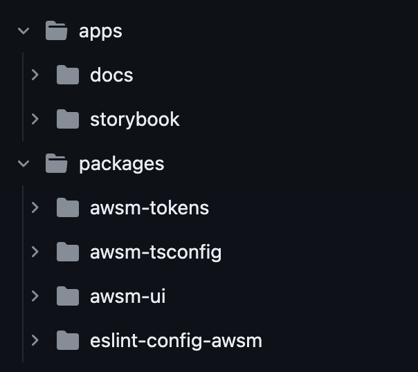
Project structure is quite standard and straightforward. It’s a pnpm-based monorepo, additionally enhanced with nx and a couple of formal configurations.
Feel free to explore the repo and read along.

packages/awsm-ui represents the UI library that needs to be developed and documented. Development premises are provided by Storybook, located in apps/storybook. Separate Storybook app is the best solution for scalability, as it can consume stories and MDX files from different packages. This is particularly useful for the modularized libraries, but even without that it offers a more clean code structure thanks to separation of concerns.
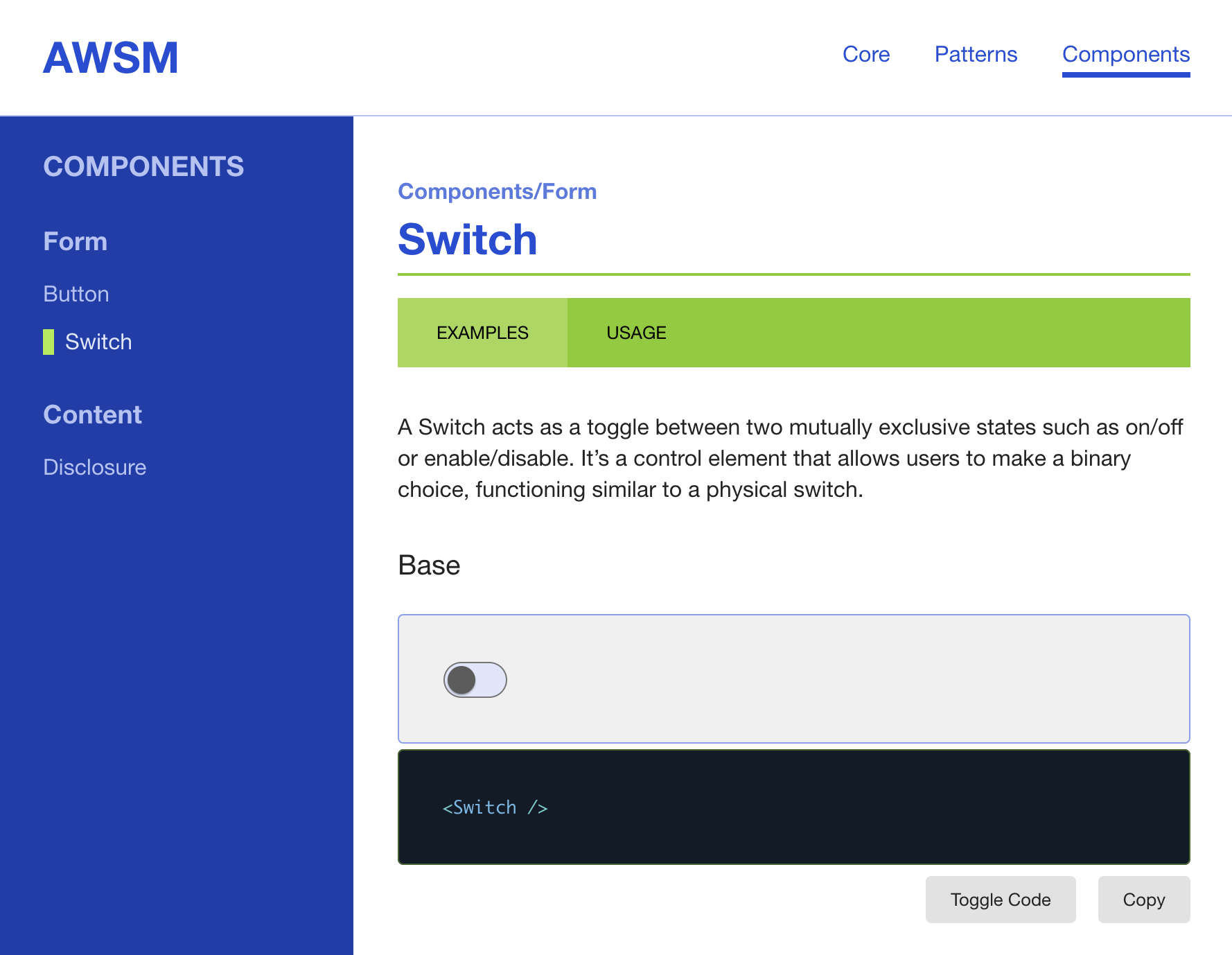
Next to Storybook sits the apps/docs app, (auto-)documentation website built with Astro, the primary subject of this article. To mimic a real-life Design System website it has a formal structure and some demo pages, traditionally in the form of MD files. The only thing it does not have is the coded UI examples. Interesting. We’ll delve into details shortly.

And last but not least, apps and packages depend on the custom Design Tokens, exported by packages/awsm-tokens. Note that there are two exported themes, suitable for both light (⚡️ electric) and dark (🦄 ultraviolet) color mode preferences.
UI Library
At this point it’s worth mentioning that there are a lot of things in this project “for demo purposes”. Sure. I am not totally opposed to the idea of using three different headless libraries for building a perfect UI, there can be more - yet sanity is the limit.
For the same reasons I selected React as the framework for the task. Love it or hate it, numbers are talking, not to mention the foundational support of its full-stack endorsers - NextJS and Remix.
In awsm-ui you may find the 3 amigos components, each based on a different headless UI library (and I’m not going to repeat that further - for demo purposes):
-
(mandatory)
Button- based on React-Aria - represents the atomic component, entity with the simple structure -
Switch- powered by Radix UI - atomic component with internal state and slightly more complex structure -
Disclosure- featuring Headless UI - more of a molecule kind… perhaps because it’s bigger

All components are styled with vanilla-extract styling engine, effectively utilizing Design Tokens in JS format. Remember the (demo) purposes? Definitely applies here as well. Nothing is stopping you from using any other CSS magic of choice.
As mentioned, all components are documented with Storybook (v^7.5). There is nothing fancy about the stories or config organization, as I try to keep things clear, unopinionated and ready for further tweaking.
Here’s a slightly reduced example of the Switch stories file:
import type { Meta, StoryObj } from '@storybook/react';

import Switch from './Switch';

export default {
  title: 'Form/Switch',
  component: Switch,
} satisfies Meta<typeof Switch>;

type Story = StoryObj<typeof Switch>;

export const Base: Story = {
  args: {},
};

export const Checked: Story = {
  args: {
    ...Base.args,
    defaultChecked: true,
  },
};

export const ColorPrimary: Story = {
  args: {
    ...Base.args,
    color: 'primary',
  },
};
As we’ll see further, more complex examples using templates and render: are also supported, so it’s not limited to plain args.
The Docs
Overview
Now let’s explore the docs app. In the project I’m using Astro v^4.0, and at the time of writing it’s already updated to 4.4, however no breaking changes are expected, so feel free to use the latest version.
In a nutshell, resulting app consists of the home page, couple of content sections - Core and Patterns, each containing an introduction and several inner pages, and the Components section, hosting static and dynamic documentation for the UI library.
App is structured in the following way:
src/
	client
	components
	content
	data
	layouts
	pages
	shared
store-
client contains the client:only components, i.e.
CopyButton -
components comprises traditional Astro building blocks
-
content is the required element of the Astro Collections, structured and filled in accordance with the navigation and website contents
-
data contains some additional MD(x) files for the section pages
-
layout and pages are standard and self-explanatory
-
shared hosts various utils and hooks
-
store is the optional state management layer, powered by nanostores
Collections
It is worth exploring collections and respective navigation for a little bit, as there is quite a high chance this will be expanded and customized. Luckily, it is actually quite simple.
The easiest way to get familiar with the navigation structure is to check out shared/globals.ts - there are a couple of constants that work in sync with the collections. For example the “Core” section needs the following:
// collection of documents
content/core/*.md

// shared/globals.ts
NAVIGATION_KEYS.core = 'core';
NAVIGATION[0] = { slug: NAVIGATION_KEYS.core, title: 'Core' }];
And that’s it for the basic collections!
Now, for the most interesting and challenging part.
Components
Components documentation is basically split into “static” and “dynamic” parts. “Static” part is imported from the dedicated content collection, whereas the “dynamic” part is loaded directly from the UI library.
The easiest way to follow how this alliance works is to start with the pages/components/[...slug].astro.
Here’s the part we need:
// pages/components/[...slug].astro excerpt

---
const { entry } = Astro.props;

stories = await import(`../../../../../packages/awsm-ui/src/components/${entry.data.dir}/${entry.data.component}.stories.tsx`);
examplesData = refineStories(stories);
---

<Examples
  data={examplesData}
  name={entry.data.component}
  dir={entry.data.dir}
/>First, we get the current Component entry data, defined in the frontmatter (we’ll get back to that later).
Second - we dynamically import and pass the stories data to the Examples component.
Note, that it is a server call and this data will be used further for rendering “slots” with names and other meta information in Examples:
// components/Examples.astro excerpt

---
const { data, name, dir } = Astro.props;
---

{data.map(([exampleName]) => {
  return (
    <Example heading={exampleName}>
      <ExampleContent
        client:only
        name={exampleName}
        componentName={name}
        componentDir={dir}
      />
    </Example>
  )
})}
Evidently, it’s a simple presentational component. The one we are actually looking for is ExampleContent - let’s dive in for a closer look.
ExampleContent is meant to be loaded on the client, this is where the dynamic heavy lifting happens. What we need from the stories are in fact the stories themselves - most typically the component variants, rendered with the different props.
Everything that we need for successful rendering can be found within the stories. Depending on the story format we might need different data.
// client/ExampleContent.tsx excerpt

const ExampleContent = (props: ExampleContentProps) => {
  const { name, componentName, componentDir } = props;

  const [struct, data, isLoading] = useStoryLoad(name, componentName, componentDir);

  const { component: AnyComponent } = struct;
  const Component = AnyComponent as JSX.ElementType;

  let Variant;

  if (data.render) {
    if (data.args) {
      const Template = data.render as JSX.ElementType;

      Variant = () => <Template {...data.args} />;
    } else {
      Variant = data.render;
    }
  } else if (Component) {
    Variant = () => <Component {...data.args} />;
  }

  return <Variant />;
}
Here, struct is an arbitrary term for the default object and it’s contents look somewhat like this:
default: {
  title: 'Form/Button',
  component: {
    '$$typeof': Symbol(react.forward_ref),
    render: [Function: Button]
  },
  parameters: { layout: 'centered', docs: [Object] },
  tags: [ 'autodocs' ]
},
Naturally, having Variant data we can render the source code if needed.
Finally, let’s have a look at the loading hook, however you won’t find anything exceptional there, as it’s pretty standard and predictable at this point. Note that struct is not mentioned here, as it’s almost identical to the name import.
// shared/hooks/useStoryLoad.ts excerpt

export const useStoryLoad = (
  name: string,
  componentName: string,
  dir: string | undefined
): [ComponentStruct, Story, boolean] => {
  const componentDir = !!dir ? dir : componentName;

  const [data, setData] = useState<Story>({});

  useEffect(() => {
    async function load() {
      const { [name]: _data } = await import(
        `../../../../../packages/awsm-ui/src/components/${componentDir}/${componentName}.stories.tsx`
      );

      setIsLoading(false);
      setData(_data);
    }

    load();
  }, []);

  return [struct, data, isLoading];
};
Binding
We explored the main mechanism behind component examples rendering, and now it’s time to get back to the documentation part.
Components collection represent the static part of the documentation and organized in a particular way:
content/
  components/
    <ComponentName>/
      index.mdx
      [usage.mdx]
    ...
index.mdx contains the introductory information about component, whereas usage.mdx is optional and may contain the docs about component application. If you wish to extend this structure with any custom pages, i.e. “Accessibility”, it’s easy to do. Check out the following files and adjust data accordingly:
-
shared/globals.ts- updateCOMPONENT_NAVIGATION -
components/Sidebar.astro- look for thecurrentSlug
What is important about both files is the frontmatter data, usage of which you could already notice in the pages/components/[...slug].astro file. We can define the schema ourselves and should follow it in all documented components:
---
title: 'Button'
page: 'Examples'
group: 'Form'
component: 'Button'
dir: 'Button'
---
Here:
-
title- is the name of the component in the docs -
page- is the name of the tab in the same docs -
group- is the custom arbitrary grouping of components; see the usage in thecomponents/Sidebar.astro -
componentanddiris what we actually use for the stories import
Gimmick
There’s one more thing. It’s more of a 🎁 bonus, actually.
Since we rely on the dynamic imports, Astro and Vite will automatically update components on changes - both components’ and stories’ code! It can give you extra flexibility on documenting (and sometimes updating) components, especially if you decide to output them in different example containers.
Conclusion
AWSM Docs presents a pragmatic approach to UI library or Design System documentation website development. While not claiming to reinvent the wheel, this solution aims to speed up and streamline the process. As with any tool, there’s room for improvement, and I encourage further exploration.
It’s worth noting that at the time of writing there’s an upgraded and enhanced version of awsm-docs being prepared, stay tuned for another article!
Check out the project on GitHub and tailor the solution to your specific needs. Your insights and contributions will undoubtedly contribute to the evolution of this approach.
Happy coding and documenting!