Read this article on Medium
Overview
There are several ways how Design System can be founded — down-top, top-down, external, originated from design or development needs and probably some others. One thing is certain — it’s important to start things small, while keeping an eye on the future setup, which is crucial for sustainable growth.
The very foundation you build today must support current needs while being agile and thought through to suffice gradual evolution of requirements within a project or organization. This article focuses on the technical backbone, essential for creating a Design System that can satisfy expanding ambitions.
The 🚀 Design System Starter Template (DSS) is built on the core components that establish a strong technical foundation for scalable and maintainable Design System. These components ensure that design and development are consistent, flexible, and efficient.
In the following sections we’ll overview primary and secondary modules of the DSS template, as well as its services and tooling. In addition we’ll explore their cost-effectiveness in the early stages of Design System and their potential in more mature stages.
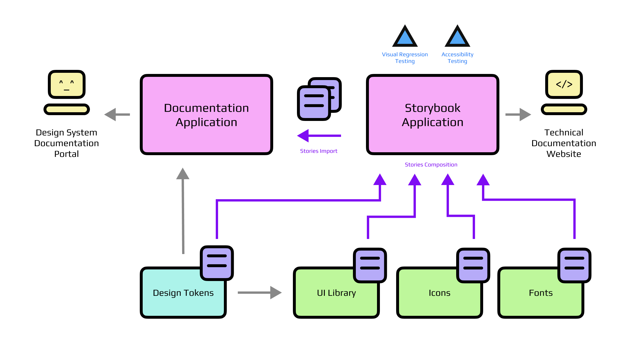
The Core Components
UI Library: The Heart of the Design System
The DSS UI library serves as the central pillar of DSS Template, built with react-aria to ensure accessibility-first, headless UI components. While React is the selected framework for the template, DSS is meant to be easily adapted to other frameworks like Vue or Solid. This adaptability allows teams to choose the technologies that best align with their project needs without being locked into a specific stack.
For styling DSS UI relies on vanilla-extract, which provides a robust scalable zero-runtime CSS base. Yet again, it’s a flexible choice, allowing for alternative approaches like CSS modules, Panda CSS, Tailwind etc.
For stability, UI components rely on the testing library, focusing on functionality in the first place. Specific testing scenarios might not be relevant in case of themed (headless) components, but essential in other scenarios.
Resulting component structure looks rather straightforward:
Switch/
  index.ts
  Switch.css.ts       - styles created with vanilla-extract
  Switch.spec.tsx     - tests using testing-library
  Switch.stories.tsx  - documentation with Storybook stories
  Switch.tsx          - component based on react-aria
It’s worth mentioning that even though DSS UI is not following a multi-package approach, it still allows for tree-shaking, leveraging respective rollup options in Vite config:
// named import
import { Button } from '@ds-starter/ui';

// default import
import Button from '@ds-starter/ui/components/Button/Button';
A critical aspect of the UI library is the early incorporation of Design Tokens. Tokens are foundational to maintaining consistent styling across Design Systems, allowing even projects that do not utilize the full UI library to benefit from a cohesive design language. With the proper semantic tokens in place, colors can be easily changed without the need for massive refactoring. Also, with the modular approach we don’t really care how Design Tokens are built, but rather what is being output.
Design Tokens: The Backbone of Consistency
Design Tokens are integral to the consistency and flexibility of the Design System. They provide a standardized approach to theming and styling across all modules and applications, ensuring that every element of the UI remains cohesive.
DSS Color Tokens are generated using 🦄 Unicornix, a tool that allows to create accessible and customizable color palettes, providing for easy start with light and dark modes. Typography and some other tokens are created with 🎨 Design Tokens Generator. Altogether this provides a solid foundation for further scaling without encountering major roadblocks.
DSS Tokens are available in both CSS and JavaScript formats, to reflect and support different project needs, from simple websites to complex web applications. Theming can be done in several ways, and here we fully rely on CSS custom properties.
Here is an excerpt from the generated CSS.
It’s easy to note that theme can be swapped completely by changing a single data attribute:
:root[data-theme='light'],
[data-theme='light'] {
  --awsm-color-content-strong: rgb(24, 26, 27);
  --awsm-color-content-regular: rgb(45, 47, 49);
  --awsm-color-background-regular: rgb(255, 255, 255);
  --awsm-color-background-subtle: rgb(236, 237, 237);
}

:root[data-theme='dark'],
[data-theme='dark'] {
  --awsm-color-content-strong: rgb(255, 255, 255);
  --awsm-color-content-regular: rgb(229, 230, 231);
  --awsm-color-background-regular: rgb(0, 0, 0);
  --awsm-color-background-subtle: rgb(9, 10, 11);
}
JS tokens can be consumed as CSS refs, containing the references to values, rather than the color strings. This approach is great for semantic variables and theming without sacrificing performance:
export const tokens = {
  content: {
    strong: 'var(--awsm-color-content-strong)',
    regular: 'var(--awsm-color-content-regular)',
  },
  background: {
    regular: 'var(--awsm-color-background-regular)',
    subtle: 'var(--awsm-color-background-subtle)',
  },
};
Icons and Fonts: Modular Visual Language
The Icons and Fonts modules add depth to the visual language. Icons are managed through an efficient process that generates components from SVG files using SVGR and tsup. This ensures that icons are consistent and can be flexibly integrated across the system.
Similar to UI components, icons can be also imported individually:
// named import
import { IconX } from '@ds-starter/icons';

// default import
import IconX from '@ds-starter/icons/lib/IconX';

// Source (SVG) import
import IconXSrc from '@ds-starter/icons/svg/x.svg';
The Fonts package offers a convenient solution for managing typography within the Design System. It supports both base64-encoded fonts for quick setups and Google Fonts integration for more robust implementations, giving teams the flexibility to choose the best approach for their project’s needs while maintaining consistent typography across all digital products.
It’s worth noting that while base64 encoding is efficient, it’s not effective for production setup. Yet in the early stages it can be a common denominator for consistent typography. Of course going further this should be replaced with the more appropriate fonts-loading strategy.
Now, the question arises — should you setup Icons and Fonts packages from the start? The answer naturally depends, however in most typical scenarios it will be a “no”. More agile environment in the early stages is crucial and less dependencies is the key. Yet, keeping in mind the upcoming structure and incorporating that in the early setup is a good idea, shaving off a couple of dozen “story points” in the future refactors.
Documentation — Storybook and Beyond
Storybook: A Multi-Purpose Development Tool
Storybook is an important tool for UI development, serving primarily as a development environment and a documentation portal on early stages of Design System. It allows to visualize and interact with UI components in various states and configurations, resolving issues early in the development process.
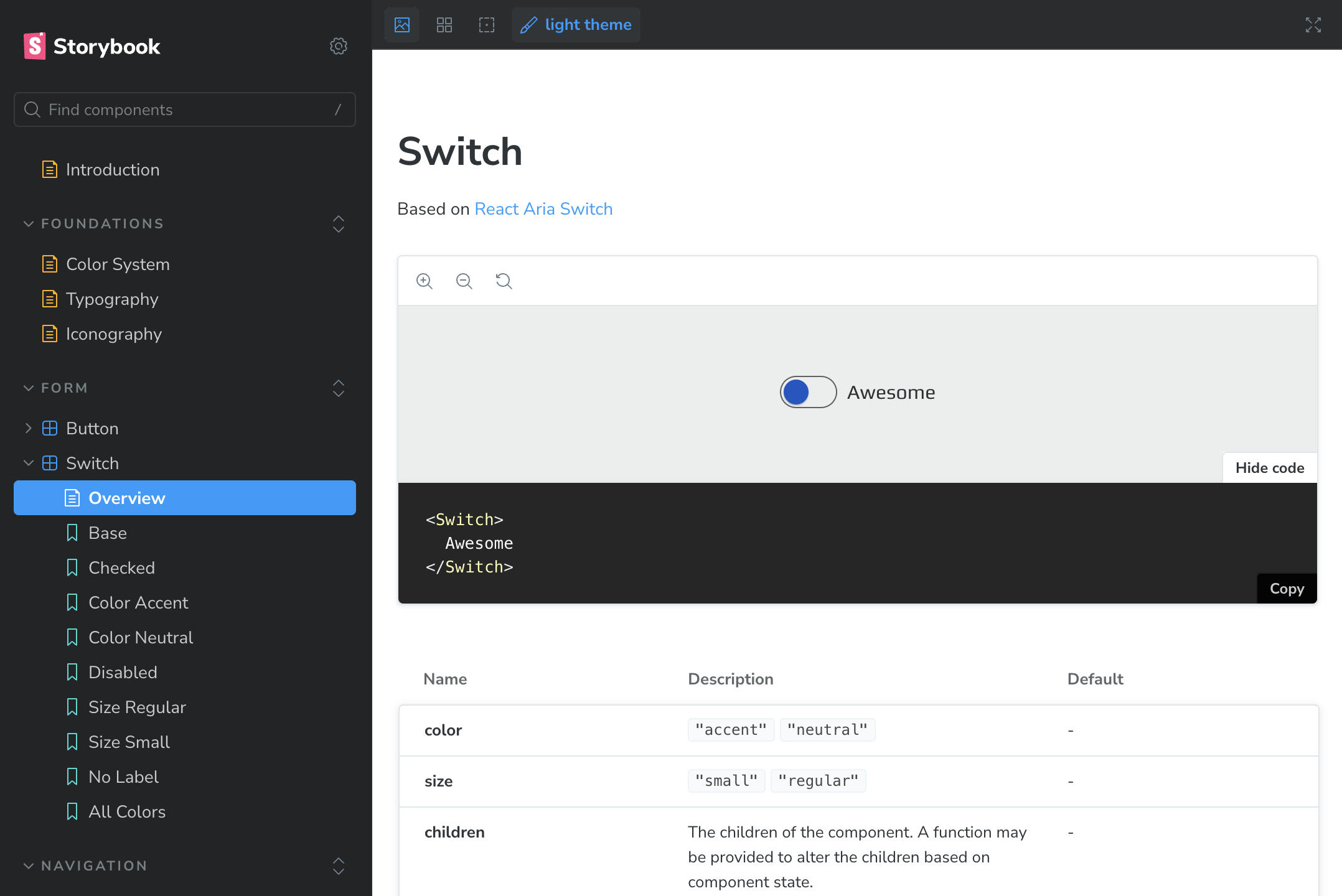
Storybook in DSS is a standalone app that does not itself host any stories — they all are collected across the packages and composed in one central hub. This way DSS Storybook can document color palettes, typography, iconography etc. along with the UI components from different sources after a simple setup.
💡 Note that there is no storybook composition per se,
yet it’s also possible as one does not deny the other.
Explore the deployed demo here: https://ds-starter-storybook.vercel.app/
Beyond its direct functionality, DSS Storybook is additionally equipped with Visual Regression Testing (VRT) and Accessibility Testing using Playwright. Such automation is essential for large design systems, where manual testing could quickly grow ineffective and time-consuming. By integrating these tests into the development workflow (early), DSS ensures that the Design System can evolve fast without fear of regressions.
While being an irreplaceable tool for early-stage documentation, consolidating component documentation and visual examples into a single platform, Storybook is not actually a documentation website. With time, more sophisticated, content-oriented and customizable solution is demanded, especially for the Design System consumers far apart from technology.
Documentation Website: Design System Knowledgebase
As the Design System matures, the need for more detailed and accessible documentation becomes paramount. The DSS Documentation Website (DSS Docs) addresses this need by providing a dedicated application for organizing and presenting information about the Design System.
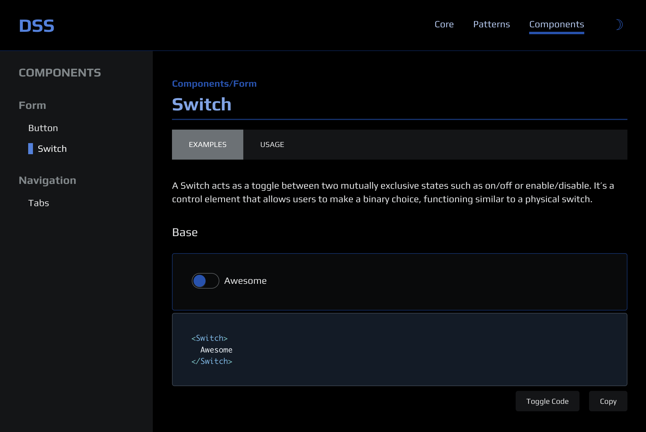
Explore the deployed demo here: https://ds-starter-docs.vercel.app/
DSS Docs is designed to be minimalistic yet highly functional and customizable. It includes several modules that can be tweaked and modified to meet the project purpose. Powered by Astro and enhanced with nanostores state manager, DSS Docs implies two main types of content: Articles and Component Documentation.
Articles offer in-depth insights into Design System concepts, provide guidelines, patterns and describe foundational layers in detail. To add a new Article is as easy as simply to place a Markdown file into the respective folder.
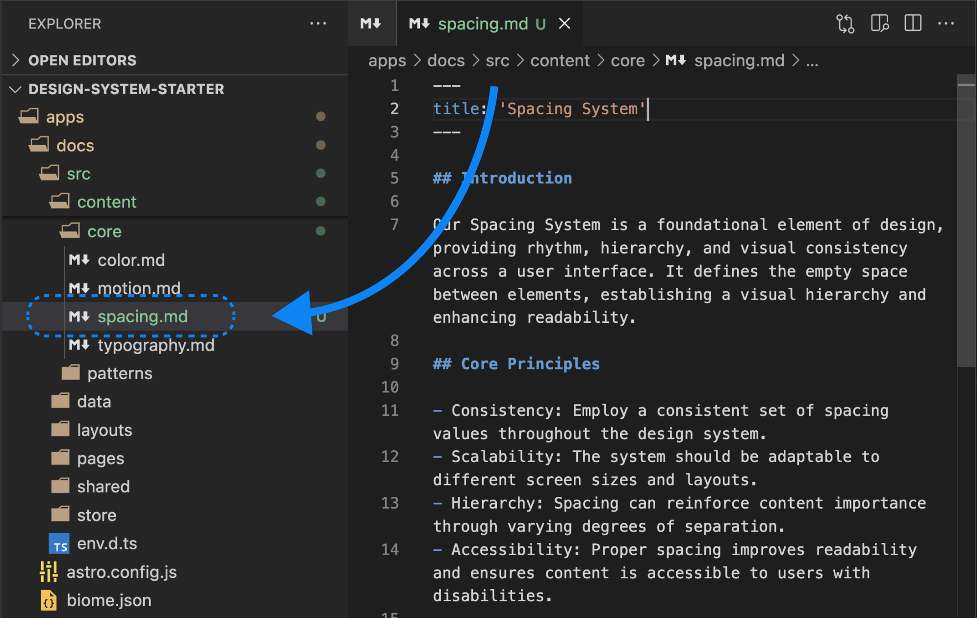
Component Documentation includes interactive examples dynamically loaded from the Storybook stories. This integration solves a couple of issues — it ensures consistency across the “Dev” and “Prod” documentation and avoids redundancy in content creation.
💡 As a bonus — component examples can be edited in the UI library and will be automatically picked up by Docs running in dev mode. Not a Storybook replacement, but can be useful for cosmetic updates.
New Component Documentation can be added with a MDX file, following a particular schema. Apart from the main description, extra sections can be added following the “Usage” pages example.
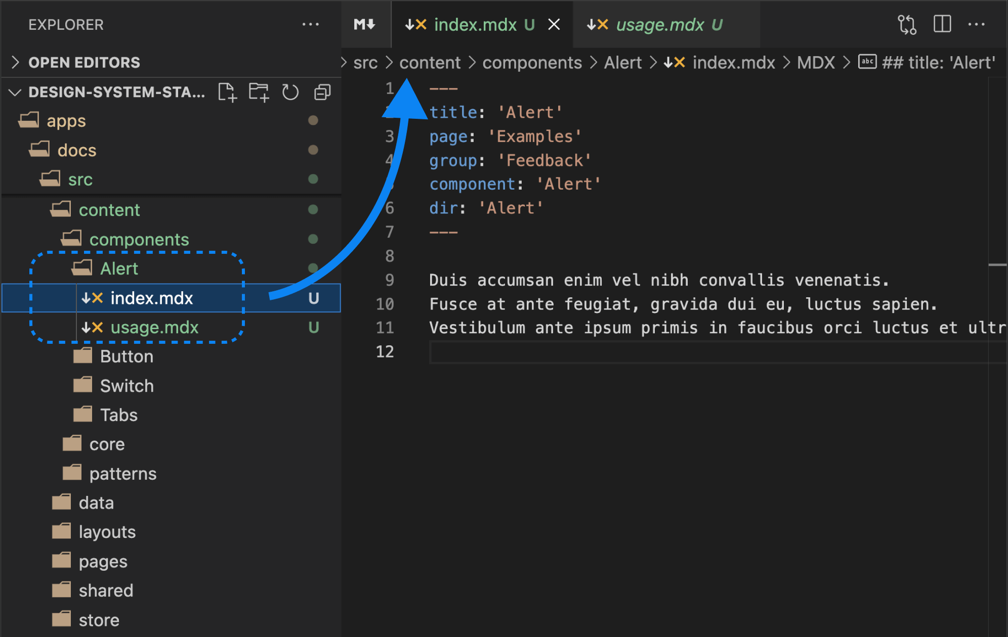
Expandable structure of DSS Docs allows for easy updates and tweaks, making it an essential tool for teams looking to step up from Storybook without significant effort and creating redundancy. The Documentation app is themed with DSS Tokens to ensure a consistent look and feel of the main product.
Automation and Workflow Best Practices
Scripts and Github Actions Automation
DSS leverages a series of scripts to handle essential tasks like testing, linting, formatting, and dependency management. Turborepo offers great help for running scripts effectively, especially when every module adheres to a unified standard.
What’s more, everything that we run locally, including Visual Regression Testing — can be done on CI, thanks to Github Actions. Apart from the thorough quality checks, Github Actions will take care of apps deployment too (powered by Vercel). Naturally, all scripts are configurable and optional.
Changelog and Release Management
DSS uses Changesets to automate the processes of changelog generation and packages releases, ensuring every change is tracked and properly versioned. Needless to say, both processes are supported by Github Actions as well.
Here are some examples of published NPM packages:
Component Generator
To further enhance productivity, DSS includes a Turbo-powered Generator that simplifies the process of scaffolding new UI components. Apart from saving time, this allows to greatly reduce the human-error-copy-paste factor.
# Run a generator
$ pnpm run gen:ui
After replying to a series of prompts, you will get the following:
- New component scaffolded in the DSS UI package, containing all respective files
- Same component added to the DSS Docs application, with the correct MDX frontmatter data
Like almost everything in DSS, generator template can and most probably need to be tweaked to the project needs. This is a completely arbitrary operation, however using generator can be very beneficial for contributors, onboarding of team members and scenarios like codebase migration.
Flexible Technology Stack
Main Design Principle
Design System technological stack is an arbitrary matter, however it’s for sure not random. It’s a natural effect of multiple contributing factors, including, but not limited to:
- product scope and project peculiarities
- initial size and future ambitions
- teams expertise and proficiency
- contributors and consumers proficiency
- client requirements and technical stack
- overall codebase age and historical reasons
- existing technical debt
- cross-platform and cross-browser support
- maintainability requirements
- existing or upcoming deadlines
- industry trends and market volatility
- organization structural changes
- and more…
💡 Would you be interested in a dedicated article on this? Let me know!
⭐️ Also, you are a reading champion, you are past 2k words by now!
The aim of the DSS template is not to comply with every single scenario, but to suggest the industry average best practices that can be further tailored to the desired experience. Understandable, Template won’t fit a lot of systems, however presented patterns and snippets can be explored, re-used, improved and hopefully inspire new creations.
Selected, Recommended, Opinionated
Throughout the article we observed multiple technologies being used in order to compose the DSS Template and provide a holistic and functional developer experience. Actually, there’re more under the hood, welcome to explore the comprehensive documentation.
Those technologies can be basically grouped into “Selected”, “Recommended” and “Opinionated” categories, so that each next one is more biased than the previous.
Consider examples:
Reactis Selected for being the most popular solution for UI libraries, it’s perfect for demonstration of UI library scaffolding.React-Ariais Recommended, because it’s the headless UI solution that prioritizes accessibility; we don’t need to invent the wheel with typical functional patterns and get lots of accessibility concerns sorted out of the box.- Using
Biomefor linting and formatting is an Opinionated choice (I appreciate the turn-key configuration and blazing performance) and can be replaced with ESLint and i.e. Prettier.
Of all other technological choices I would like to (additionally) highlight the Opinionated ones:
- Vanilla-extract as the CSS solution is great for scalable projects that prioritize performance and server-side rendering compatibility. While it has a somewhat higher entry threshold, it provides a very friendly CSS-in-JS experience without CSS-in-JS downsides.
- Nanostores is the go-to solution when it comes to minimalistic and effective global state management in the apps. It shines in the island-like architecture and
Astroprojects in particular. DSS Docs featurenanostoresfor basic operations like toggling theme or source code, but it’s capable of managing much more complex tasks.
Finally, Typescript is the technology that stands out being in all three groups simultaneously. It has been around for a while to become industry standard, it is generally recommended for complex projects like Design System and I would also use it further for similar reasons.
Closing Thoughts
Building any product requires a solid foundation, a clear roadmap, careful preparations, and timely revisions at every milestone. As requirements evolve over time, your technology should be resilient enough to adapt effectively to new settings.
With Design Systems, it’s all of that, plus the element of perpetual motion. Can you think of a universal development approach that can handle project unpredictability and versatility beyond the good ol’ Markup and Style? Maybe later, but for now, this is just the way of things.
The 🚀 Design System Starter Template can help you in establishing a strong technological core and may even become a great starting point, providing a modular and flexible solution for your next Design System challenge. However, for the most part, it’s the groundwork for insights and sparks of inspiration. This has happened to me several times during the development of DSS to the extent of pivoting on tools, which is why I think it’s useful. I’m definitely looking forward to and inviting you to the next encounters.